Designing the Ideal Online Course
This article covers a final project I wrote for STAT 4770 at the Wharton School of Business. It covers Data Science in Python and analyses the attributes that make online courses successful.
Foreword
I took STAT 4770 (Data Science in Python) at the Wharton School of Business in 2022. The criteria of the following project involved coming up with novel data science project spanning three main criteria:
- Data Collection
- Data Visualisation
- Data Analysis
We were given a few weeks to complete the project and I decided to combine already available data with some that I manually web scraped in order to design the ideal online course.
Designing the Ideal Online Course
Written by Dhruv Agrawal
Introduction
The demand for Massive Open Online Courses (MOOCs) has increased dramatically in the past few years, from less than a million learners around the world in 2011 to over 200 million in 2021. 1 This massive shift towards online learning has raised a huge question: how can course-makers cater to market demand and maximise student satisfation with their courses? This project will combine datasets from the three of the biggest MOOC platforms: Coursera, edX, and Udemy. Then, it will analyse the most significant factors affecting an online course’s success and indicate the key avenues for creating a successful online course.
The phenomenon this project discovers shows that the most impactful courses are delivered on edX and Coursera, and that factors like difficulty, course duration, and subject matter play huge roles in the popularity of an online course. To summarise, the ideal course found through the upcoming analysis is a high quality online course hosted on Coursera, no longer than 35 hours in duration. For the purpose of this project, a high quality course is defined as one with a rating above 4 out of 5. Additionally, this course would ideally be of easy difficulty if related to Information Technology or Computer Science, and of intermediate to high difficulty if related to Business and Finance.
There are some limitations of this project in terms of measuring success in an online course. These will be addressed throughout the analysis and I will make an argument for why when dealing with ratings and the number of course subscribers, they are both highly correlated context variables. Another limitation with measuring success is that there are only two major context variables - rating and number of subscribers. I will address other methods for measuring success in the conclusion along with potential future analysis into interesting phenomena noted in the data.
Value Proposition and Background
Ever head of Harvard’s CS50 or The Science of Well-Being by Yale? These two courses are offered by two of the most prestigious educational institutions in the world and provide both credence to the name of the universities running them and invaluable knowledge to the students enrolled in them.
As a student studying Computer Science, I constantly try to find courses relevant to the current market demand for this field. Millions of other students were put in the same situation through online learning during COVID, and universities around the world realised the profitability and educational value of creating online courses accessible to people anywhere in the world. There are so many reasons to study the demand for online courses and consequently, there are many stakeholders involved:
- Universities and other educational institutions: by understanding the market for online courses, these institutions can better cater to future demands and create more relevant courses for students, ultimately leading to increased prestige, profits, and funding for the research done by the institution.
-
Advertisers: when a course has great demand, this opens up a huge opportunity for advertisers to promote relevant products. Andrew Ng, the creator of Stanford’s Machine Learning online course, used the immense popularity for this course to promote a book he was writing and eventually a website - deeplearning.ai with many sponsors and additional online courses.
- MOOC Platforms: by understanding what courses students truly enjoy, MOOC platforms can improve their recommender systems and advertise courses that are more likely to be successful. The market for MOOCs is already growing rapidly and keeping up-to-date with the evolving market is necessary to continue this growth over the critical next few years.
The reason why this project is so unique is because as explained above, MOOCs are really new and really exciting! Educational institutions are only now starting to ramp online course production and none of the data in this project is more than a year old. Analysing these trends will shape the future of education and inspire other researchers to direct more interest into studying the demand for online courses.
Data Acquisition
Loading Data
One unique approach I’m taking is to combine several datasets from courses on Coursera, edX, and Udemy. This will mean I can not only compare trends on a specific platform but also analyse the aggregate trends across all three platforms.
I acquired some of the data from Kaggle:
- Coursera data: https://www.kaggle.com/datasets/siddharthm1698/coursera-course-dataset
- edX data: https://www.kaggle.com/datasets/imuhammad/edx-courses
- Udemy data: https://www.kaggle.com/datasets/thedevastator/udemy-courses-revenue-generation-and-course-anal
However, even though Kaggle datasets are usually cleaned, there was a lot of crucial information missing from some of the datasets. In reality, the main reason I chose to use these Kaggle datasets was to get a list of URLs for courses.
Additionally, there was another Udemy dataset that looked interesting, however, after some preliminary analysis, I found that the data looked into different trends than the ones I wanted to focus on. In the future, it would be great to go back and analyse this dataset, however, I decided not to pursue it. Specifically, it focused on Udemy tech courses and avenues for further interesting research would be to extract the keywords from the course descriptions of different tech related courses and see what specific skills are in demand in the tech industry, and how that changes over time.
Combining Data
coursera_df = pd.read_csv('data/coursera_data_2021.csv')

udemy_business_df = pd.read_csv('data/udemy_business_course_data.csv')
udemy_design_df = pd.read_csv('data/udemy_design_course_data.csv')
udemy_music_df = pd.read_csv('data/udemy_music_course_data.csv')
udemy_web_dev_df = pd.read_csv('data/udemy_web_dev_course_data.csv')
udemy_business_df['source'] = 'business'
udemy_design_df['source'] = 'design'
udemy_music_df['source'] = 'music'
udemy_web_dev_df['source'] = 'web_dev'
udemy_df = pd.concat([udemy_business_df, udemy_design_df, udemy_music_df, udemy_web_dev_df])

edx_df = pd.read_csv('data/edx_data.csv')
Cleaning Coursera Data
The Coursera data is missing the number of subscribers and the subject category for each of the courses. To fix this, it is necessary to web scrape the data directly from Coursera. Initially, I tried applying for an affiliate API key but when I tried making some API calls, I realised that the API was deprecated and that they had introduced an affiliate program which I could not join. Instead, I explored some of the websites for each of the URLs and realised that I could use BeautifulSoup to scrape all the data I wanted.
coursera_df
| Course Name | University | Difficulty Level | Course Rating | Course URL | Course Description | Skills | |
|---|---|---|---|---|---|---|---|
| 0 | Write A Feature Length Screenplay For Film Or ... | Michigan State University | Beginner | 4.8 | https://www.coursera.org/learn/write-a-feature... | Write a Full Length Feature Film Script In th... | Drama Comedy peering screenwriting film D... |
| 1 | Business Strategy: Business Model Canvas Analy... | Coursera Project Network | Beginner | 4.8 | https://www.coursera.org/learn/canvas-analysis... | By the end of this guided project, you will be... | Finance business plan persona (user experien... |
| 2 | Silicon Thin Film Solar Cells | �cole Polytechnique | Advanced | 4.1 | https://www.coursera.org/learn/silicon-thin-fi... | This course consists of a general presentation... | chemistry physics Solar Energy film lambda... |
| 3 | Finance for Managers | IESE Business School | Intermediate | 4.8 | https://www.coursera.org/learn/operational-fin... | When it comes to numbers, there is always more... | accounts receivable dupont analysis analysis... |
| 4 | Retrieve Data using Single-Table SQL Queries | Coursera Project Network | Beginner | 4.6 | https://www.coursera.org/learn/single-table-sq... | In this course you�ll learn how to effectively... | Data Analysis select (sql) database manageme... |
| ... | ... | ... | ... | ... | ... | ... | ... |
| 3517 | Capstone: Retrieving, Processing, and Visualiz... | University of Michigan | Beginner | 4.6 | https://www.coursera.org/learn/python-data-vis... | In the capstone, students will build a series ... | Databases syntax analysis web Data Visuali... |
| 3518 | Patrick Henry: Forgotten Founder | University of Virginia | Intermediate | 4.9 | https://www.coursera.org/learn/henry | �Give me liberty, or give me death:� Rememberi... | retirement Causality career history of the ... |
| 3519 | Business intelligence and data analytics: Gene... | Macquarie University | Advanced | 4.6 | https://www.coursera.org/learn/business-intell... | �Megatrends� heavily influence today�s organis... | analytics tableau software Business Intellig... |
| 3520 | Rigid Body Dynamics | Korea Advanced Institute of Science and Techno... | Beginner | 4.6 | https://www.coursera.org/learn/rigid-body-dyna... | This course teaches dynamics, one of the basic... | Angular Mechanical Design fluid mechanics F... |
| 3521 | Architecting with Google Kubernetes Engine: Pr... | Google Cloud | Intermediate | 4.7 | https://www.coursera.org/learn/deploying-secur... | In this course, "Architecting with Google Kube... | bigtable bigquery SQL Google Cloud Platform... |
3522 rows × 7 columns
Scraping Coursera Data
from bs4 import BeautifulSoup

def get_coursera_course_category(course_url):
    soup = BeautifulSoup(requests.get(course_url).text, 'html.parser')
    all_anchor_tags = soup.find_all('a')
    all_browse_indices = []
    for index, tag in enumerate(all_anchor_tags):
        if tag.text == 'Browse':
            all_browse_indices.append(index)

    if enroll_num := soup.find('strong'):
        if enroll_num.text.replace(',', '').isdigit():
            num_enrolled = int(enroll_num.text.replace(',', ''))
        else:
            num_enrolled = pd.NA
    else:
        num_enrolled = pd.NA

    if len(all_browse_indices) < 2:
        return pd.NA, num_enrolled
    else:
        return all_anchor_tags[all_browse_indices[1] + 1].text, num_enrolled
count = 0
for index, row in coursera_df.iterrows():
    coursera_df.loc[index, 'category'], coursera_df.loc[index, 'num_subscribers'] = get_coursera_course_category(row['Course URL'])
    count += 1

    if count % 100 == 0:
        print(f'Processed {count} rows')

coursera_df.to_csv('data/coursera_data_2021_updated.csv')
Processed 100 rows
Processed 200 rows
Processed 300 rows
Processed 400 rows
Processed 500 rows
Processed 600 rows
Processed 700 rows
Processed 800 rows
Processed 900 rows
Processed 1000 rows
Processed 1100 rows
Processed 1200 rows
Processed 1300 rows
Processed 1400 rows
Processed 1500 rows
Processed 1600 rows
Processed 1700 rows
Processed 1800 rows
Processed 1900 rows
Processed 2000 rows
Processed 2100 rows
Processed 2200 rows
Processed 2300 rows
Processed 2400 rows
Processed 2500 rows
Processed 2600 rows
Processed 2700 rows
Processed 2800 rows
Processed 2900 rows
Processed 3000 rows
Processed 3100 rows
Processed 3200 rows
Processed 3300 rows
Processed 3400 rows
Processed 3500 rows
Challenges
Some of the URLs do not have endpoints because the course has either been deleted or is not taking any new enrollments. The URLs from the original dataset are from last year and so, many courses had finished and were no longer publicly available. Additionally, when I looked into the div elements for the data I wanted, I found that they were generic and I needed to implement some additional checks to make sure I was getting the right values for each course - I did this by checking for strong tags for the subscriber count, and looking for the browse anchor tag for the subject category.
Another challenge was that the number of subscribers was comma separated on each thousand (eg. 235,000) which could not be converted to an integer so after researching potential solutions, I decided to remove all commas and then check if it was a number before converting it to an integer. I also wanted to make my code Pythonic, and a big part of that is using Python’s language to make code more readable. I did some research into different ways to do this, and decided to use the walrus operator (:=) to do an inline assignment and comparison in my if statements.
Cleaning Udemy Data
When I explored the Udemy dataset shown below, I found that the rating values were decimal values. Initially I thought they had been standardised on a scale from 0 to 1, however, when I inspected some of the courses at their URLs, I found that courses with a lower number in the dataset sometimes had a higher rating on Udemy itself. This can be explained in one of two ways:
- The rating values in the dataset are unreliable values and do not reflect actual ratings
- The rating values in the dataset are old values and the ratings for the courses have changed since 2021 when they were collected
In either case, it was a good idea to regenerate that column via webscraping.
udemy_df
| course_id | course_title | url | price | num_subscribers | num_reviews | num_lectures | level | Rating | content_duration | published_timestamp | subject | source | |
|---|---|---|---|---|---|---|---|---|---|---|---|---|---|
| 0 | 49798.0 | Bitcoin or How I Learned to Stop Worrying and ... | https://www.udemy.com/bitcoin-or-how-i-learned... | 0.0 | 65576.0 | 936.0 | 24.0 | All Levels | 0.56 | 8.0 | 2013-04-20T02:25:22Z | Business Finance | business |
| 1 | 48841.0 | Accounting in 60 Minutes - A Brief Introduction | https://www.udemy.com/accounting-in-60-minutes... | 0.0 | 56659.0 | 4397.0 | 16.0 | Beginner Level | 0.95 | 1.5 | 2013-04-07T21:39:25Z | Business Finance | business |
| 2 | 133536.0 | Stock Market Investing for Beginners | https://www.udemy.com/the-beginners-guide-to-t... | 0.0 | 50855.0 | 2698.0 | 15.0 | All Levels | 0.91 | 1.5 | 2013-12-25T19:53:34Z | Business Finance | business |
| 3 | 151668.0 | Introduction to Financial Modeling | https://www.udemy.com/financial-modeling-asimp... | 0.0 | 29167.0 | 1463.0 | 8.0 | All Levels | 0.18 | 1.5 | 2014-05-27T16:22:16Z | Business Finance | business |
| 4 | 648826.0 | The Complete Financial Analyst Course 2017 | https://www.udemy.com/the-complete-financial-a... | 195.0 | 24481.0 | 2347.0 | 174.0 | All Levels | 0.37 | 10.0 | 2016-01-21T01:38:48Z | Business Finance | business |
| ... | ... | ... | ... | ... | ... | ... | ... | ... | ... | ... | ... | ... | ... |
| 1200 | 1227578.0 | Learning Path: The Road to Elasticsearch | https://www.udemy.com/learning-path-the-road-t... | 200.0 | 50.0 | 5.0 | 60.0 | Beginner Level | 0.96 | 5.0 | 2017-05-29T17:56:24Z | Subject: Web Development | web_dev |
| 1201 | 1277924.0 | Angular 4 Front To Back | https://www.udemy.com/angular-4-front-to-back/ | 40.0 | 44.0 | 0.0 | 68.0 | All Levels | 0.15 | 8.5 | 2017-07-06T15:04:55Z | Subject: Web Development | web_dev |
| 1202 | 1248172.0 | Essentials of Spring 5.0 for Developers | https://www.udemy.com/essentials-of-spring-50-... | 125.0 | 34.0 | 2.0 | 21.0 | Beginner Level | 0.46 | 1.5 | 2017-06-11T18:34:40Z | Subject: Web Development | web_dev |
| 1203 | 1250934.0 | Display and analyze GIS data on the web with L... | https://www.udemy.com/display-and-analyze-gis-... | 100.0 | 25.0 | 4.0 | 66.0 | Beginner Level | 0.67 | 12.5 | 2017-06-15T21:17:43Z | Subject: Web Development | web_dev |
| 1204 | 1270222.0 | Learning Path: Web Applications with Spring an... | https://www.udemy.com/learning-path-web-applic... | 200.0 | 19.0 | 2.0 | 33.0 | Beginner Level | 0.12 | 4.0 | 2017-06-28T21:04:21Z | Subject: Web Development | web_dev |
3681 rows × 13 columns
Scraping Udemy Data
This was much simpler than scraping Coursera data because Udemy has good labelling for their span and div tags. I looked into the HTML and found the exact place needed to get the rating number and simply converted the data to a float so that I could analyse it properly later.
def get_udemy_course_rating(course_url):
    if pd.isna(course_url):
        return pd.NA

    soup = BeautifulSoup(requests.get(course_url).text, 'html.parser')
    rating = soup.find('span', {'data-purpose': 'rating-number'})
    if rating:
        return float(rating.text.replace(',', '.'))
    else:
        return pd.NA
count = 0
for index, row in udemy_df.iterrows():
    if pd.isna(row['rating_cleaned']):
        udemy_df.loc[index, 'rating_cleaned'] = get_udemy_course_rating(row['course_url'])
        count += 1

    if count % 100 == 0:
        print(f'Processed {count} rows')

# save to csv so we can load this next time (scraping took over 2 hours)
udemy_df.to_csv('data/udemy_course_data_updated.csv')
Processed 0 rows
Processed 100 rows
Processed 100 rows
Processed 200 rows
Processed 200 rows
Processed 300 rows
Processed 300 rows
Processed 300 rows
Processed 400 rows
Processed 400 rows
Processed 400 rows
Processed 400 rows
Processed 400 rows
Processed 500 rows
Processed 500 rows
Processed 600 rows
Processed 700 rows
Processed 700 rows
Processed 700 rows
Processed 700 rows
Processed 800 rows
Processed 900 rows
Processed 900 rows
Processed 900 rows
Processed 900 rows
Processed 1000 rows
Processed 1000 rows
Processed 1100 rows
Processed 1100 rows
Processed 1100 rows
Processed 1100 rows
Processed 1100 rows
Processed 1200 rows
Processed 1200 rows
Processed 1300 rows
Processed 1400 rows
Processed 1400 rows
Processed 1400 rows
Processed 1500 rows
Processed 1600 rows
Combining the datasets
One big challenge was combining all three datasets since they came from different sources. The different factors I had to consider were:
- Before combining the data, the column names had to be the same
- Different measurements needed the same scale (eg. difficulty had to be beginner, intermidiate, advanced)
- Different string values like course_length needed to be edited to remove letters and then converted to integers
- Any duplicate columns had to be removed based on URL (as this is a unique identifier for each course)
- The index had to be reset
The third point proved to be difficult as I forgot a lot of regular expressions and spent a while debugging that until it was able to filter out everything but the important numerical values.
After adding code to solve all of the above, such as the code below for the edX dataset, I had three cleaned datasets that I could analyse individually or combine to find aggregate trends.
edx_df.drop(columns=['course_syllabus', 'course_description', 'instructors'], inplace=True)
edx_df.rename(
    columns={
        'title': 'name',
        'summary': 'description',
        'n_enrolled': 'num_subscribers',
        'course_type': 'course_pacing',
        'institution': 'university',
        'Level': 'difficulty',
        'subject': 'category',
        'length': 'course_length',
        'price': 'price',
        'course_url': 'url',
    }, inplace=True)

edx_df['num_subscribers'] = edx_df['num_subscribers'].replace(',', '', regex=True).astype('Int64')
edx_df['course_length'] = edx_df['course_length'].replace('Weeks', '', regex=True).astype('Int64')
edx_df['course_effort'] = edx_df['course_effort'].replace('–[0-9]* hours per week', '', regex=True).astype('Int64')
edx_df['content_duration'] = edx_df['course_length'] * edx_df['course_effort']
edx_df['difficulty'].replace({'Introductory': 'Beginner', 'Intermediate': 'Intermediate', 'Advanced': 'Advanced'}, inplace=True)

edx_df['platform'] = 'edx'
edx_df.drop_duplicates(subset=['url'], inplace=True)
edx_df.set_index('url', inplace=True, verify_integrity=True)

edx_df
| name | description | num_subscribers | course_pacing | university | difficulty | category | language | subtitles | course_effort | course_length | price | content_duration | platform | |
|---|---|---|---|---|---|---|---|---|---|---|---|---|---|---|
| url | ||||||||||||||
| https://www.edx.org/course/how-to-learn-online | How to Learn Online | Learn essential strategies for successful onli... | 124980 | Self-paced on your time | edX | Beginner | Education & Teacher Training | English | English | 2 | 2 | FREE-Add a Verified Certificate for $49 USD | 4 | edx |
| https://www.edx.org/course/programming-for-everybody-getting-started-with-pyt | Programming for Everybody (Getting Started wit... | This course is a "no prerequisite" introductio... | 293864 | Self-paced on your time | The University of Michigan | Beginner | Computer Science | English | English | 2 | 7 | FREE-Add a Verified Certificate for $49 USD | 14 | edx |
| https://www.edx.org/course/cs50s-introduction-to-computer-science | CS50's Introduction to Computer Science | An introduction to the intellectual enterprise... | 2442271 | Self-paced on your time | Harvard University | Beginner | Computer Science | English | English | 6 | 12 | FREE-Add a Verified Certificate for $90 USD | 72 | edx |
| https://www.edx.org/course/the-analytics-edge | The Analytics Edge | Through inspiring examples and stories, discov... | 129555 | Instructor-led on a course schedule | Massachusetts Institute of Technology | Intermediate | Data Analysis & Statistics | English | English | 10 | 13 | FREE-Add a Verified Certificate for $199 USD | 130 | edx |
| https://www.edx.org/course/marketing-analytics-marketing-measurement-strategy | Marketing Analytics: Marketing Measurement Str... | This course is part of a MicroMasters® Program | 81140 | Self-paced on your time | University of California, Berkeley | Beginner | Computer Science | English | English | 5 | 4 | FREE-Add a Verified Certificate for $249 USD | 20 | edx |
| ... | ... | ... | ... | ... | ... | ... | ... | ... | ... | ... | ... | ... | ... | ... |
| https://www.edx.org/course/leaders-in-citizen-security-and-justice-management | Leaders in Citizen Security and Justice Manage... | Learn about the latest in prevention, police a... | <NA> | Self-paced on your time | Inter-American Development Bank | Intermediate | Social Sciences | English | English | 4 | 10 | FREE-Add a Verified Certificate for $25 USD | 40 | edx |
| https://www.edx.org/course/pattern-studying-and-making | Pattern Studying and Making | 图案审美与创作 | Fantastic experiences in beauty and its repres... | <NA> | Self-paced on your time | Tsinghua University | Beginner | Art & Culture | 中文 | English, 中文 | 3 | 12 | FREE-Add a Verified Certificate for $139 USD | 36 | edx |
| https://www.edx.org/course/computational-neuroscience-neuronal-dynamics-of-co | Computational Neuroscience: Neuronal Dynamics ... | This course explains the mathematical and comp... | 11246 | Self-paced on your time | École polytechnique fédérale de Lausanne | Advanced | Biology & Life Sciences | English | English | 4 | 6 | FREE-Add a Verified Certificate for $139 USD | 24 | edx |
| https://www.edx.org/course/cities-and-the-challenge-of-sustainable-developmen | Cities and the Challenge of Sustainable Develo... | What is a sustainable city? Learn the basics h... | 8775 | Self-paced on your time | SDG Academy | Beginner | Environmental Studies | English | English | 1 | 1 | FREE-Add a Verified Certificate for $25 USD | 1 | edx |
| https://www.edx.org/course/mathtrackx-special-functions | MathTrackX: Special Functions | Understand trigonometric, exponential and loga... | <NA> | Self-paced on your time | University of Adelaide | Beginner | Math | English | English | 3 | 4 | FREE-Add a Verified Certificate for $79 USD | 12 | edx |
974 rows × 14 columns
Data Visualisation
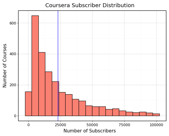
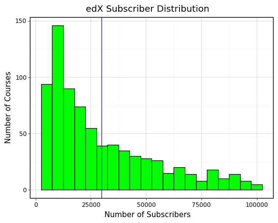
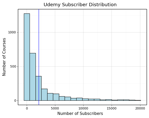
Understanding the Subscriber Distributions across Platforms
The main ways to measure course success are by looking at course ratings and subscriber counts. Subscriber counts are the most concrete as they are a direct representation of the demand for the course. Before visualising the explanatory variables against subscriber count, it’s important to understand the distribution of subscriber counts across the three platforms. This can be seen in the plots at the bottom of this slide.
What we see is that Coursera and edX have very similar subscriber distributions as they are larger sites with similar educational institutions uploading courses. Udemy falls far behind them in terms of subscriber count as we can see and it also has a much longer tail than the other platforms. This can be explained by Udemy’s focus on individual course creators, which means that there is a much greater supply of courses and less reputation to go off for students when deciding which creator’s courses to choose. We will need to account for this in more detail to understand the true differences between hosting courses on each platform.
# cleaning the coursera data to plot the ratings
coursera_plot_df = coursera_df[coursera_df['rating'] != 'Not Calibrated']
coursera_plot_df['rating'] = coursera_plot_df['rating'].astype(float)
coursera_plot_df = coursera_plot_df[coursera_plot_df['num_subscribers'] <= 100000]

# coursera plot
coursera_plot_df = (
    pn.ggplot(coursera_plot_df, pn.aes(x='num_subscribers'))
    + pn.geom_histogram(bins=20, fill='salmon', color='black')
    + pn.geom_vline(pn.aes(xintercept=coursera_plot_df['num_subscribers'].mean()), color='blue')

    + pn.xlab('Number of Subscribers')
    + pn.ylab('Number of Courses')
    + pn.ggtitle('Coursera Subscriber Distribution')
    + pn.theme_linedraw()
)
coursera_plot_df

# edX plot
edx_plot_df = edx_df[edx_df['num_subscribers'] <= 100000]
edx_plot = (
    pn.ggplot(edx_plot_df, pn.aes(x='num_subscribers'))
    + pn.geom_histogram(bins=20, fill='lime', color='black')
    + pn.geom_vline(pn.aes(xintercept=edx_plot_df['num_subscribers'].mean()), color='blue')

    + pn.xlab('Number of Subscribers')
    + pn.ylab('Number of Courses')
    + pn.ggtitle('edX Subscriber Distribution')
    + pn.theme_linedraw()
)
edx_plot

# Udemy plot
udemy_plot_df = udemy_df[udemy_df['rating'] >= 2.5]
udemy_plot_df = udemy_plot_df[udemy_plot_df['num_subscribers'] <= 20000]
udemy_plot = (
    pn.ggplot(udemy_plot_df, pn.aes(x='num_subscribers'))
    + pn.geom_vline(pn.aes(xintercept=udemy_plot_df['num_subscribers'].mean()), color='blue')
    + pn.geom_histogram(bins=20, fill='lightblue', color='black')

    + pn.xlab('Number of Subscribers')
    + pn.ylab('Number of Courses')
    + pn.ggtitle('Udemy Subscriber Distribution')
    + pn.theme_linedraw()
)
udemy_plot
<ggplot: (357559272)>
<ggplot: (357596531)>
<ggplot: (357641695)>
Honing in on the Subscriber Distribution
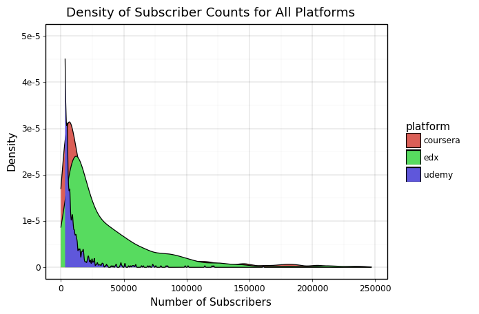
We have had a brief look at the subscriber distribution in each platform and can see both the mean and the general shape of the distribution. However, we can compare this in a more visually informative format to get a better idea of the differences in subscriber distributions across the platforms. We can do this using a density plot which shows us not only the shape of the distribution but allows us to compare all three platforms at once. This density plot is shown at the bottom of this slide.
This plot is integral to this project. It indicates and explains a few key factors:
- The peak number of subscribers for every platform is under 50000. This number is expected to increase as MOOCs become more popular and it would be interesting coming back to this in a few years and seeing how the shape of the curve shifts to the right.
- Udemy has a really high peak at a small number of subscribers and then rapidly drops off. This can be attributed to the individual creator aspect of Udemy and shows us that for making smaller courses that affect a moderate number of people, choosing a platform like Udemy could be very useful.
- At the tail, Coursera and edX perform similarly because they are the two largest platforms to access MOOCs from large universities and educational institutions. These are not only the highest quality courses but have reputations and advertising attached to them that help them reach a level of subscribers that is incredibly hard for solo creators on Udemy.
# combining and cleaning data
all_df = pd.concat([edx_df, udemy_df, coursera_df])
all_df = all_df[all_df['num_subscribers'] <= 250000]
all_df['num_subscribers'] = all_df['num_subscribers'].astype(int)

# creating density plot
sub_density_plot = (
    pn.ggplot(all_df, pn.aes(x='num_subscribers', fill='platform'))
    + pn.geom_density()
    # we need to use scale_y_continuous as there are a huge number of udemy courses that have
    # virtually no subscribers and these obscure the relationship we want to see between each
    # platform
    + pn.scale_y_continuous(limits=(0, 0.00005))

    + pn.xlab('Number of Subscribers')
    + pn.ylab('Density')
    + pn.ggtitle('Density of Subscriber Counts for All Platforms')
    + pn.theme_linedraw()
)
sub_density_plot
<ggplot: (360065305)>
Explaining Demand Based on Course Difficulty
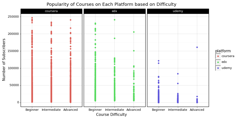
Plotting each course by its difficulty and faceting on each platform yields the plot at the bottom of this slide. The key points from this are:
- Even though there is a lot of noise in the data, we can clearly see that over every platform, there are fewer hard courses with a high subscriber count than easier courses. From this we can conclude that a significant amount of the demand for MOOCs is to learn new skills more than to improve oneself in an existing area of strength.
- Regardless of diffculty, the vast majority of courses have a low subscriber count and this could impact further analysis a lot. We can see that online course subscriber counts can be really unpredictable and a lot of institutions produce a lot of courses, most of which do not end up doing really well. To overcome this, we will be analysing the upper threshold. ie. we will look at the potential for a successful course based on attributes of the course rather than a prediction of its success. This is really useful because it gives a clearer picture on what structure to give courses such that they have a higher potential to do well.
difficulty_over_platforms_plot = (
    pn.ggplot(all_df, pn.aes(x='difficulty', y='num_subscribers', color='platform'))
    + pn.geom_point()
    # we want a standardised set of difficulty levels for each platform
    + pn.scale_x_discrete(limits=['Beginner', 'Intermediate', 'Advanced'])
    + pn.facet_wrap('platform')

    + pn.xlab('Course Difficulty')
    + pn.ylab('Number of Subscribers')
    + pn.ggtitle('Popularity of Courses on Each Platform based on Difficulty')
    + pn.theme_linedraw()
    + pn.theme(figure_size=(10, 5))
)
difficulty_over_platforms_plot
<ggplot: (373284087)>
Zoning in on Difficulty by Subject
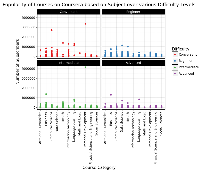
Looking at the difficulty of courses by subject adds a new dimension to the visualisations so far. The first thing to note is that I decided to focus on Coursera because I found that it reveals a trend much more clearler than when it is combined with the other datasets. This is because across platforms, there are different thresholds for different diffculty levels and the institutions labelling diffculty. Additionally, we can see in the plot below that there are 4 different difficulty levels. Coursera ranks courses from easiest to hardest as Conversant, Beginner, Intermediate, and Advanced.
Let’s focus in on Computer Science and Business in the plot below. What we can see for Computer Science is that as the difficulty increases, the potential for a high subscriber count decreases (it keeps trending downwards when we step up the difficulty). This is very different to Business courses where we can see that Intermediate difficulty courses have a much higher potential than Beginner courses. The trend is still evident in Advanced courses but less so. This is an indication that in the technology sector, people prefer to online learn new content, whereas in the business sector, people prefer to build on their existing knowledge.
This is very consistent with observations from the real-world where different fields in Computer Science are quickly picked up and constantly change, whereas this is a slower process in Business.
coursera_plot_df = coursera_df[coursera_df['rating'] != 'Not Calibrated']
coursera_plot_df = coursera_plot_df[coursera_plot_df['difficulty'] != 'Not Calibrated']
coursera_plot_df = coursera_plot_df[coursera_plot_df['num_subscribers'].notna()]

coursera_plot_df['rating'] = coursera_plot_df['rating'].astype(float)
coursera_plot_df['num_subscribers'] = coursera_plot_df['num_subscribers'].astype(int)
coursera_plot_df = coursera_plot_df[(coursera_plot_df['rating'] >= 3) & (coursera_plot_df['rating'] <= 5)]

coursera_plot_df['difficulty'] = pd.Categorical(coursera_plot_df['difficulty'], categories=['Conversant', 'Beginner', 'Intermediate', 'Advanced'], ordered=True)

coursera_subject_difficulty_plot = (
    pn.ggplot(coursera_plot_df, pn.aes(x='category', y='num_subscribers', color='difficulty'))
    + pn.geom_point()
    + pn.xlab('Course Category')
    + pn.ylab('Number of Subscribers')
    + pn.ggtitle('Popularity of Courses on Coursera based on Subject over various Difficulty Levels')
    + pn.theme_linedraw()
    + pn.theme(axis_text_x=pn.element_text(rotation=90))
    + pn.guides(color=pn.guide_legend(title="Difficulty"))
    + pn.facet_wrap('difficulty')
    + pn.scale_colour_brewer(type='qual', palette=6)
)
coursera_subject_difficulty_plot
<ggplot: (369443976)>
Relating Course Length to Difficulty
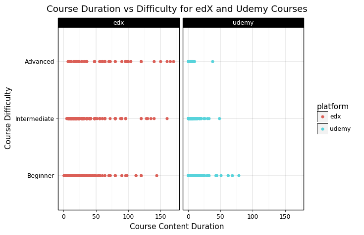
After learning that people prefer simpler courses in general, I was curious to see if there was a relationship between the duration of a course and its difficulty. However, after plotting duration and difficulty as shown below, it is clear that there is no strong relationship between these two factors and so we can conclude that difficulty is specifically related to the content of the course and not how difficult it is to commit to finishing the course.
all_course_duration_df = all_df.dropna(subset=['content_duration'])

duration_difficulty_plot = (
    pn.ggplot(all_course_duration_df, pn.aes(x='content_duration', y='difficulty', color='platform'))
    + pn.geom_point()
    + pn.facet_wrap('platform')
    # we are using scale_y_discrete as edX has an 'All Levels' difficulty that doesn't
    # compare to anything from Udemy
    + pn.scale_y_discrete(limits=['Beginner', 'Intermediate', 'Advanced'])

    + pn.xlab('Course Content Duration')
    + pn.ylab('Course Difficulty')
    + pn.ggtitle('Course Duration vs Difficulty for edX and Udemy Courses')
    + pn.theme_linedraw()
)
duration_difficulty_plot
<ggplot: (375992694)>
Visualising Pricing for Udemy Courses
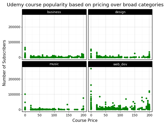
Udemy courses have a wide range of pricing brackets that are set by the publisher of the course. This is unique to Udemy because Coursera and edX have audit options for almost all of their courses which means that most students take them for free. As Udemy courses are mostly published by individual creators who do not have the ability to offer their courses for free, they have different pricing optinos. As we can see from the plot below, over all four broad subject categories the most effective pricing option is to offer the course for free, and the second most popular is to charge around $200 for the course.
This is hard to explain but from manually looking at the different courses at high price points, what I interpret this graph to indicate is that when people pay for a course, they would rather pay extra for a much more developed course. The biggest barrier is offering a course for any price at all but for the people who buy courses, if they spend a bit of money, they would rather spend some more to find the best course.
This is really interesting when designing the ideal online course because it shows that it is best to either offer the course for free if one is part of an educational institution, or to charge as much as needed (to a reasonable amount) such that the end result is a polished and well-presented course.
udemy_df['price'] = udemy_df['price'].astype(float)

udemy_pricing_plot = (
    pn.ggplot(udemy_df, pn.aes(x='price', y='num_subscribers'))
    + pn.geom_point(color='green')
    + pn.facet_wrap('category')

    + pn.xlab('Course Price')
    + pn.ylab('Number of Subscribers')
    + pn.ggtitle('Udemy course popularity based on pricing over broad categories')
    + pn.theme_linedraw()
)
udemy_pricing_plot
<ggplot: (358383517)>
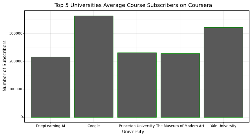
Effect of University on Subscriber Count
As we can see in the plot below, the educational institution running the course has a huge impact on the demand for the course. This makes sense because many universities have courses with large followings such as Harvard’s CS50 which people all around the world look forward to doing each year. This means that depending on the level of popularity one wants from their course, it might be a good idea to try running it on Udemy instead because this is a more friendly platform for individual creators whereas Coursera is shown to be dominated by really reputable institutions. However, if one is from one of these institutions, it is definitely a good idea to run courses on Coursera and edX to develpp a global following.
university_df = coursera_df.groupby('university')
top_universities_by_mean_sub = university_df['num_subscribers'].apply(
    lambda x: np.mean(x)
    ).sort_values(ascending=False).head(5)

top_universities_by_mean_sub_df = pd.DataFrame(top_universities_by_mean_sub).reset_index()

top_universities_mean_sub_plot = (
    pn.ggplot(top_universities_by_mean_sub_df, pn.aes(x='university', y='num_subscribers'))
    + pn.geom_bar(stat='identity', color='green')

    + pn.xlab('University')
    + pn.ylab('Number of Subscribers')
    + pn.ggtitle('Top 5 Universities Average Course Subscribers on Coursera')
    + pn.theme_linedraw()
    + pn.theme(figure_size=(10, 5))
)

top_universities_mean_sub_plot
<ggplot: (371496316)>
Data Analysis
In this section, there are two major issues I want to explore. The first is to develop a rough understanding on how content duration truly affects the demand for a course and the second is to understand the relationship between course ratings and subscriber count.
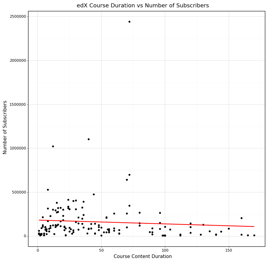
Analysing the Duration of Courses
What we see when we take the top three courses from each duration and plot them is that there is a slight negative trend such that as the amount of hours of content increases, there are less subscribers. This can be attributed to the fact that usually people want to learn a skill fast and having the ability to do a short course can be much more rewarding than doing a longer form course in terms of instant gratification for finishing. However, this is a weak trend because we also know that there are a lot more courses with low durations than high durations and so there are a lot more options to pick when choosing the top three courses of each duration.
# remove content duration nan values
edx_df = edx_df[edx_df['content_duration'].notna()]
edx_df = edx_df[edx_df['num_subscribers'].notna()]
edx_df['content_duration'] = edx_df['content_duration'].astype(float)
edx_df['num_subscribers'] = edx_df['num_subscribers'].astype(int)
top_duration_df = edx_df.groupby('content_duration').apply(lambda x: x.sort_values('num_subscribers', ascending=False).head(3))

edx_duration_popularity_plot = (
    pn.ggplot(top_duration_df, pn.aes(x='content_duration', y='num_subscribers'))
    + pn.geom_point()
    + pn.geom_smooth(method='lm', se=False, color='red', formula='y ~ x')
    + pn.xlab('Course Content Duration')
    + pn.ylab('Number of Subscribers')
    + pn.ggtitle('edX Course Duration vs Number of Subscribers')
    + pn.theme_linedraw()
    + pn.theme(figure_size=(10, 10))
)
edx_duration_popularity_plot
<ggplot: (371412511)>
Relating Rating to Subscriber Count
One assumption we have made throughout the data cleaning and visualisation process is that both ratings and subscriber counts are outcome variables. After researching the use of this variables in existing data science research papers and came to a few conclusions:
- When measuring demand for a course, the subscriber count was a direct numerical value to represent that whereas rating was more of a proxy for the course quality.
- When courses only have a few reviews, they can vary from extremely low to high ratings and this is not a great indicator of the actual course quality.
- As a proxy feature, ratings were not appropriate in the visualisations above because those visualisations were focused on the direct impact of individual features on the subscriber count.
- Developing a relationship between ratings and subscriber count could bring some more light into the effectiveness of good quality courses.
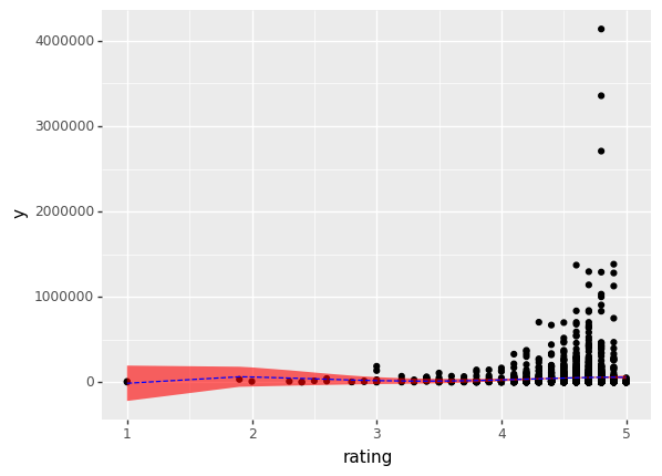
Realising all of this, I decided to estimate the relationship between ratings and subscriber count as shown below.
# estimating a quartic relationship (a + bx + cx^2 + dx^3 + ex^4)
y, X = patsy.dmatrices(
    'num_subscribers ~ rating + I(rating**2) + I(rating**3) + I(rating**4)',
    data = coursera_rating_cleaned_df,
    return_type = 'dataframe'
)

original_model = sm.OLS(y, X)
original_model_fitted = original_model.fit()

original_model_fitted.summary()
| Dep. Variable: | num_subscribers | R-squared: | 0.004 |
|---|---|---|---|
| Model: | OLS | Adj. R-squared: | 0.003 |
| Method: | Least Squares | F-statistic: | 3.101 |
| Date: | Sat, 24 Dec 2022 | Prob (F-statistic): | 0.0147 |
| Time: | 09:25:34 | Log-Likelihood: | -39605. |
| No. Observations: | 2968 | AIC: | 7.922e+04 |
| Df Residuals: | 2963 | BIC: | 7.925e+04 |
| Df Model: | 4 | ||
| Covariance Type: | nonrobust |
| coef | std err | t | P>|t| | [0.025 | 0.975] | |
|---|---|---|---|---|---|---|
| Intercept | -5.634e+05 | 5.97e+05 | -0.944 | 0.345 | -1.73e+06 | 6.07e+05 |
| rating | 9.612e+05 | 8.88e+05 | 1.082 | 0.279 | -7.8e+05 | 2.7e+06 |
| I(rating ** 2) | -5.097e+05 | 4.46e+05 | -1.142 | 0.254 | -1.39e+06 | 3.66e+05 |
| I(rating ** 3) | 1.09e+05 | 9.28e+04 | 1.175 | 0.240 | -7.29e+04 | 2.91e+05 |
| I(rating ** 4) | -8115.7078 | 6865.307 | -1.182 | 0.237 | -2.16e+04 | 5345.546 |
| Omnibus: | 5611.869 | Durbin-Watson: | 2.027 |
|---|---|---|---|
| Prob(Omnibus): | 0.000 | Jarque-Bera (JB): | 11177483.504 |
| Skew: | 14.163 | Prob(JB): | 0.00 |
| Kurtosis: | 302.302 | Cond. No. | 1.95e+05 |
Notes:
[1] Standard Errors assume that the covariance matrix of the errors is correctly specified.
[2] The condition number is large, 1.95e+05. This might indicate that there are
strong multicollinearity or other numerical problems.
Processing the Results
As we can see above, the r-squared value is extremely low and there does not seem to be any apparent relationship between ratings and subscriber counts using the quartic estimation model above. However, plotting the data is always effective in bringing more light to the issue at hand.
original_model_predictions = original_model_fitted.get_prediction()

coursera_original_fitted_predictions_df = pd.concat(
    [
        coursera_rating_cleaned_df.loc[:, ['rating', 'num_subscribers']],
        best_predictions.summary_frame()
    ],
    axis = 1
)
coursera_original_fitted_predictions_plot = (
    pn.ggplot(coursera_original_fitted_predictions_df, pn.aes(x='rating'))
    + pn.geom_point(pn.aes(y='y'))
    + pn.geom_ribbon(pn.aes(ymin='mean_ci_lower', ymax='mean_ci_upper'), fill='red', alpha=0.6)
    + pn.geom_line(pn.aes(y='mean'), color='blue', linetype='dashed')
)
coursera_original_fitted_predictions_plot
<ggplot: (357742565)>
Observations and New Path to Take
It is really obvious from the plot what is going wrong with the model - every course has a rating value associated with it, even the lower subscribed courses which have only a few ratings and vary dramatically. Because of the sheer volume of courses available and the skew towards courses with certain attributes explored above (difficulty, subject, duration etc), there are a lot more courses with low subscriber counts at each rating value and this pushes the prediction down significantly.
How do we fix this?
Doing something similar to the analysis for course duration is really effective because it allows us to see the relationship between the quality of a course and the upside this has on the potential maximum subscriber count.
Revised Data and Model
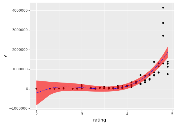
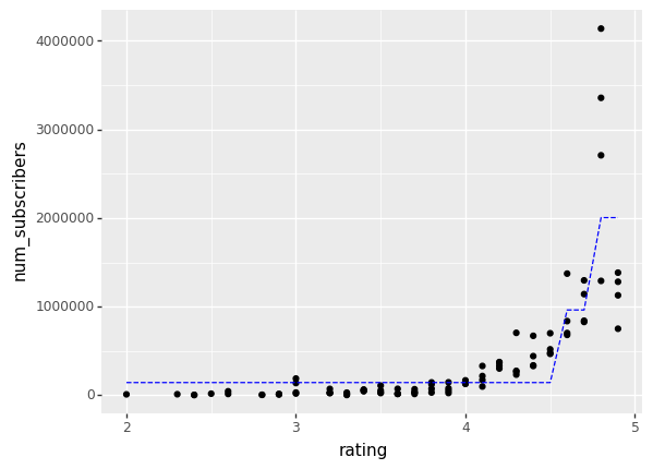
I decided to take the top 4 courses by subscriber count at each rating value. I did this by plotting various different numbers and finding a compromise between having too much variance and too many outliers that negatively impacted the data’s reliability.
top_4_subscribers_per_rating_df = (
    coursera_rating_cleaned_df
    .groupby('rating')
    .apply(lambda x: x.nlargest(4, 'num_subscribers'))
    .reset_index(drop=True)
)

# we are filtering out ratings that are too low or too high because they are unpredictable and only exist because of
# low subscriber counts
top_4_subscribers_per_rating_df = top_4_subscribers_per_rating_df[top_4_subscribers_per_rating_df['rating'] != 5.0]
top_4_subscribers_per_rating_df = top_4_subscribers_per_rating_df[top_4_subscribers_per_rating_df['rating'] >= 2.0]
Estimating the Model Part 2
When I ran the same quartic model on this new data, there was a really high r-squared value and the plot showed that even with a quartic model we were capturing a strong relationship. However, we were overfitting to the data because there was too much flexibility with a quartic model. Additionally, the data is more shaped to be approximated with an odd-degree quadratic model from the general relationship so I did that with a cubic model.
The cubic model did not sacrifice a lot of the relationship but made the model family simpler.
import patsy

y, X = patsy.dmatrices(
    'num_subscribers ~ rating + I(rating**2) + I(rating**3)',
    data = top_4_subscribers_per_rating_df,
    return_type = 'dataframe'
)

revised_model = sm.OLS(y, X)
revised_model_fitted = revised_model.fit()

revised_model_fitted.summary()
| Dep. Variable: | num_subscribers | R-squared: | 0.625 |
|---|---|---|---|
| Model: | OLS | Adj. R-squared: | 0.612 |
| Method: | Least Squares | F-statistic: | 46.76 |
| Date: | Sat, 24 Dec 2022 | Prob (F-statistic): | 7.18e-18 |
| Time: | 09:46:45 | Log-Likelihood: | -1264.1 |
| No. Observations: | 88 | AIC: | 2536. |
| Df Residuals: | 84 | BIC: | 2546. |
| Df Model: | 3 | ||
| Covariance Type: | nonrobust |
| coef | std err | t | P>|t| | [0.025 | 0.975] | |
|---|---|---|---|---|---|---|
| Intercept | -1.019e+07 | 4.59e+06 | -2.223 | 0.029 | -1.93e+07 | -1.07e+06 |
| rating | 1.035e+07 | 4.02e+06 | 2.573 | 0.012 | 2.35e+06 | 1.84e+07 |
| I(rating ** 2) | -3.415e+06 | 1.15e+06 | -2.977 | 0.004 | -5.7e+06 | -1.13e+06 |
| I(rating ** 3) | 3.683e+05 | 1.06e+05 | 3.461 | 0.001 | 1.57e+05 | 5.8e+05 |
| Omnibus: | 99.919 | Durbin-Watson: | 0.919 |
|---|---|---|---|
| Prob(Omnibus): | 0.000 | Jarque-Bera (JB): | 1590.069 |
| Skew: | 3.569 | Prob(JB): | 0.00 |
| Kurtosis: | 22.563 | Cond. No. | 9.46e+03 |
Notes:
[1] Standard Errors assume that the covariance matrix of the errors is correctly specified.
[2] The condition number is large, 9.46e+03. This might indicate that there are
strong multicollinearity or other numerical problems.
Revised Plot and Explanation
As we can see below, the revised plot shows a clear trend that is captured well by the cubic model. This shows that there is definitely a relationship between the quality of a course (as measured by its rating) and its potential maximum subscriber count.
(
    pn.ggplot(revised_rating_sub_model_df,
              pn.aes(x='rating')
    )
    + pn.geom_point(pn.aes(y='y'))
    + pn.geom_ribbon(pn.aes(ymin='mean_ci_lower', ymax='mean_ci_upper'), fill='red', alpha=0.6)
    + pn.geom_line(pn.aes(y='mean'), color='blue', linetype='dashed')
)
<ggplot: (357804011)>
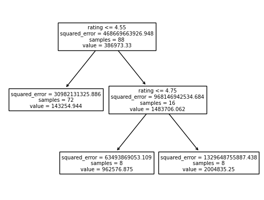
Using a Decision Tree to Streamline this Approach
By using the plot of the general shape of the data, we were able to determine that a cubic relationship was suitable in the estimation above. However, in order to streamline this process, I decided to use a decision tree. This process allows this project to use existing machine learning techniques and forms the basis for future analysis using other supervised learning algorithms to get a stronger prediction of how likely a course is to be successful and based on that, how to minimise costs and maximise course popularity.
rating_sub_tree_3_model = DecisionTreeRegressor(max_leaf_nodes=3)
rating_sub_tree_3_model.fit(X, y)

# plot the decision tree
sklearn.tree.plot_tree(rating_sub_tree_3_model, feature_names=['rating'])

# plotnine plot with the decision tree
(
    pn.ggplot(top_4_subscribers_per_rating_df,
                pn.aes(x='rating')
    )
    + pn.geom_point(pn.aes(y='num_subscribers'))
    + pn.geom_line(pn.aes(y=regressor.predict(X)), color='blue', linetype='dashed')
)
DecisionTreeRegressor(max_leaf_nodes=3)In a Jupyter environment, please rerun this cell to show the HTML representation or trust the notebook.
On GitHub, the HTML representation is unable to render, please try loading this page with nbviewer.org.
DecisionTreeRegressor(max_leaf_nodes=3)
[Text(0.4, 0.8333333333333334, 'rating <= 4.55\nsquared_error = 468669663926.948\nsamples = 88\nvalue = 386973.33'),
 Text(0.2, 0.5, 'squared_error = 30982131325.886\nsamples = 72\nvalue = 143254.944'),
 Text(0.6, 0.5, 'rating <= 4.75\nsquared_error = 968146942534.684\nsamples = 16\nvalue = 1483706.062'),
 Text(0.4, 0.16666666666666666, 'squared_error = 63493869053.109\nsamples = 8\nvalue = 962576.875'),
 Text(0.8, 0.16666666666666666, 'squared_error = 1329648755887.438\nsamples = 8\nvalue = 2004835.25')]
<ggplot: (375963389)>
What does this show?
There are only 3 leaf nodes as we only want to capture and study the general trends. We can see that the model decided that for all courses up to a rating of 4, they would not have a low potential subscriber count. This is because courses on Coursera have ratings skewed towards 5/5 and so, for a course to be rated below 4 indicates that there is some negative factor dragging the course down.
Once we reach a rating of 4/5, the model rapidly increases the potential prediction and this continues to about 5/5 because this a point of anomaly as it is almost impossible for a highly subscribed course to have a 5/5 rating. It is really clear from this model that having a high quality course does a lot in terms of increasing the potential popularity of the course. A lot of the success around these courses comes from recommendations online, from friends, and universities so it makes sense that when people like a course they will talk to those around them and make the course even more popular.
jupyter nbconvert project.ipynb –to slides –post serve –SlidesExporter.reveal_scroll=True
Summary of Findings
Through the visualisation and analysis of a novel dataset, this project determines how factors like duration, quality, and difficulty (which are intrinsic to an online course) affect the course’s popularity. We showed that in different subjects like Computer Science, people prefer easier courses whereas for Business there is a preference for intermediate difficulty courses, and we were able to explain this with other real world research into people’s preferences.
Additionally, looking at how shorter form courses can be more powerful than long form ones is extremely useful as it shows that there is no reason for institutions to invest money into longer form courses simply to boost engagement. In other words, if the content would be taught better in long-form then there is a potential for high popularity, but there is no reason to increase the content length simply to appeal to students.
Finally, we showed that there is a strong link between a course’s quality (represented by rating) and its maximum potential number of subscribers. This opens up huge avenues for further research that will be explained below. By showing this, we can conclude that although rating is an outcome variable, when we build a course for the purpose of maximising popularity, it is also important to build the course well so that students will enjoy it and rate it highly.
Next Steps
As we have established a connection between rating and course popularity, future work on this topic would involve finding out how different factors affect a course’s rating. This is much more advanced than the scope of this project due to the high variance in course ratings and difficulty in explaining it for courses without a high number of ratings. One way to do this would be to restrict the dataset to courses above a certain number of subscribers but that introduces some bias as we would only be finding features amongst the best online courses (like the institution running the course etc) which cannot be easily adopted by other institutions. Another way to account for this would be to do some weighted uncertainty system where course ratings are upweighted based on the number of ratings they have as we are more confident in these predictions. This would be a much more effective awy to conduct this analysis.
There would be significant benefits of this analysis - it would allow online course platforms to improve their recommender systems and better adjust to the influx of online courses by choosing which types of courses to build more infrastructure around and invest more money into. A lot of the biggest institutions in the world like MIT have so many publicly available online courses and they are on the forefront of making education as accessible as possible. Because of this, I believe their researchers would be passionate about furthering this type of reseaching and investing into ways to gauge how to improve course quality and popularity would definitely help them many better courses.
I want to continue working on this project in the future and to research novel ways to incorporate course features to increase course quality and demand, it would take about 2-3 FTE months. This is because the analysis pipeline would involve studying features of interest, building models around them and constantly tuning these features and measuring the effects. For example, over time students might start preferring harder courses as the market for online courses shifts to professionals who are trying to extend their skills. This would affect the model and would need more tuning. Overall this would involve:
- Continuing my analysis which would take about a month to gather data using web scraping to find review numbers and a web crawler to gather a larger set of MOOCs courses so that I have more data to generalise on
- There would be minimal monetary costs outside of programming wages, however, additional costs related to training a supervised learning model would be required
- Training a model could take a long time depending on the type of model used, however, if a decision tree or some sort of ensemble such as a random forest is used, it would be much faster and can either be done locally or using a platform such as Google Colab. This would make the entire training process take only a few hours at most.
- Although the entire pipeline could take thousands of dollars in terms of personal expenses and computation, it has the potential to optimise a $30 billion market.
Challenges of the Entire Pipeline
- The biggest challenge is that online course popularity comes down to a lot of luck sometimes. Sometimes it takes an educational institution finding the course and recommending it to students for it to develop popularity. Other times, prestige can be a big factor such as when Harvard releases a new course compared to smaller institutions without a global reputation. Because of this, the tool this project builds cannot be used as an exact predictor, moreso it will act as a guide to gauge the potential of a course and understand what factors can be changed to increase the likelihood of success.
- Another challenge already mentioned is the changing market and working out how to maintain the model at a low cost while ensuring it remains accurate. This can be solved by weighting newer data compared to older data but further research must be done before any concrete solution to this problem can be found.
Data Inputs and Outputs
The input data would consist of the following:
- A URL bank with a list of all the courses currently offered across different platforms (in this case specifically Coursera, edX, and Udemy)
- Ideally, access to the affiliate APIs would make this analysis much more simple and would give access to a lot of metrics that aren’t on the client side HTML of these websites like archived courses and how course subscriber numbers have changed over time
- Without access to these APIs, the input would involve web scraping in a similar way to what was done in this project but over a much larger dataset. Because this would take a huge amount of time, I would need to learn how to use multithreading with BeautifulSoup and hopefully that would speed up the process by at least 100 times
- A dashboard that can be used for future evaluation based on changes in the market such as how demand for specific durations of courses has changed since the pandemic, and how the demand for Computer Science courses has changed in the current economy where companies are laying off a lot of employees and implementing hiring freezes
- More information on how the language of delivery affects course popularity because as online course accessibility increases, it will become more and more important to make sure language isn’t a barrier to the best education possible
The outputs would be:
- Visualisations which show a clear relationship between the growth of online course delivery and consumption in different countries with different primary languages of instructure. This would be extremely useful in learning what parts of the world produce the most courses (currently most courses have English as the sole language of instruction which was evident in some analysis truncated from this project). By understanding this relationship, platforms like Coursera can determine where to invest more money into developing new courses so that more people can access education.
- An ensemble model (one that combines other supervised learning models like random forests and logistic regression) that is able to make accuracy predictions on the demand for courses and the potential number of subscribers the course would have. Additionally, a goal further down the line would be for the model to suggest different tweaks to course features that would improve the course’s potential to do well and this could be used a lot in planning the structure of a course before it is actually created.
Transforming Inputs to Outputs
After collecting data for the inputs there would be a few key steps in the pipeline:
- Cleaning and Basic Visualisation - We would need to make some preliminary univariate and bivariate plots to understand the general shape of the data and try to find any overarching patterns that could be of interest. Additionally, after visualising the data there would be some more cleaning and preprocessing to make sure that the data isn’t skewed heavily by a few outliers and that if there are any clear features, that they are reflected well in the raw data.
- Further Visualisation and Dimensionality Reduction - Then, we would need to construct multivariate plots that can encompass the larger picture of the data. As there are a lot of different features involved, using some sort of dimensionality reduction such as PCA would be really useful in this stage and some unsupervised learning such as K-means clustering could be useful to find patterns in the data.
- Supervised Learning Model Generation - Once we have found the key features that affect course quality and popularity using the above steps, we would incorporate this into various supervised learning models such as by making decision trees and regression models. In this step it is important to capture the trend in the data but not overfit it. This means plots and dimensionality reduction would be useful to make sure we are capturing the general trend and not morphing the predictions to fit the training data. Cross-validation would also be useful in this step to help with that.
- Production - Once we have trained a model, we need to test it and verify its accuracy and reliability. This step would involve applying the model to a new set of courses that are not included in the training process. Additionally, this model would need to be fed new information over time and would need to use some sort of random sampling to make sure that over time, it changes to fit the evolving market. This would be a big challenge becauase it is really hard to predict the market and so, there would be some constant maintenance required to make sure the model is still accurate. During this process, the model can be used by institutions and would be extremely useful for the reasons already discussed.
This application of data science is really exciting because we are only at the start of the online learning era, and through interest and engagement in learning about this industry, we can dramatically increase the accessibility of education around the world.
-
https://www.mckinsey.com/industries/education/our-insights/demand-for-online-education-is-growing-are-providers-ready ↩
Comments